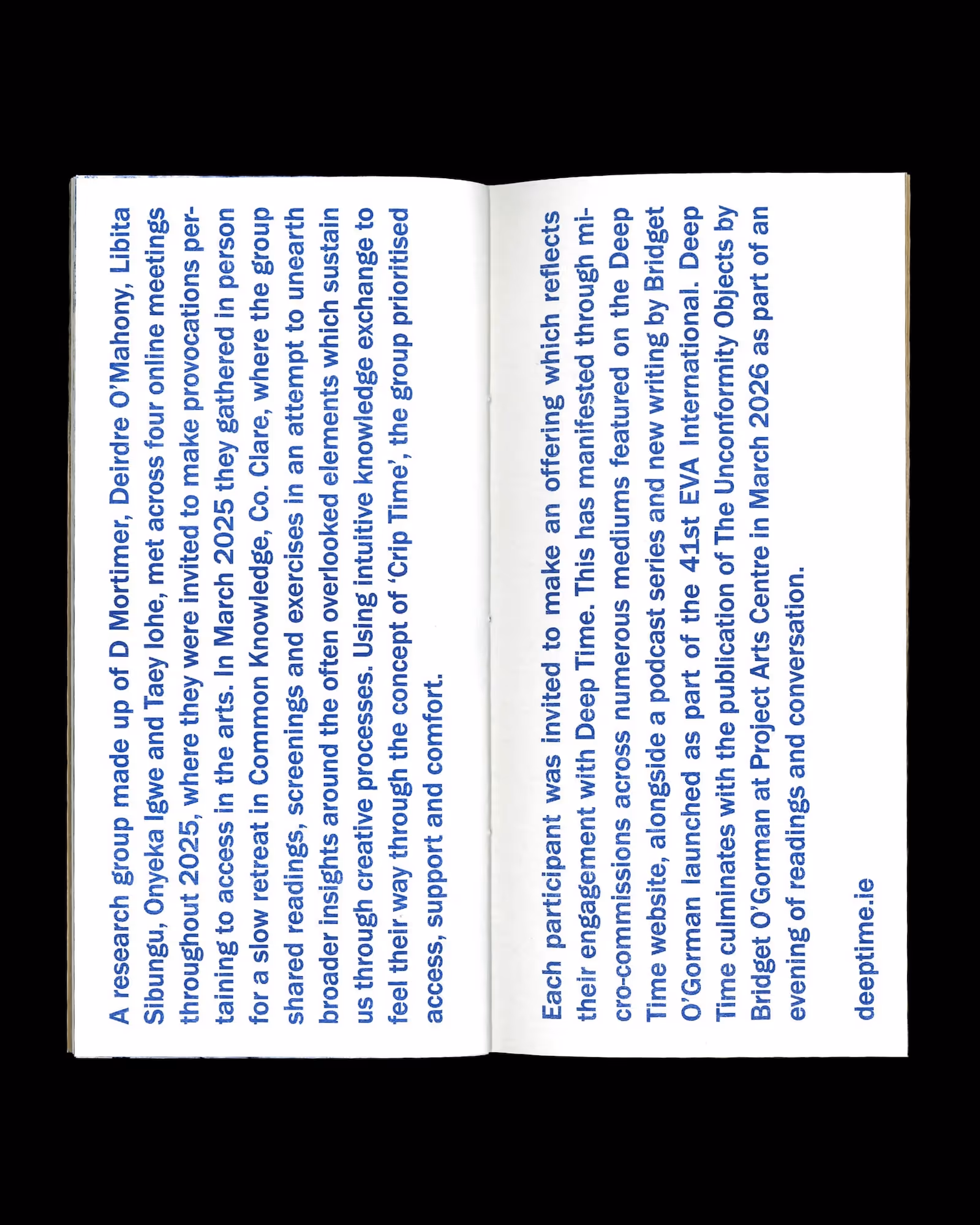
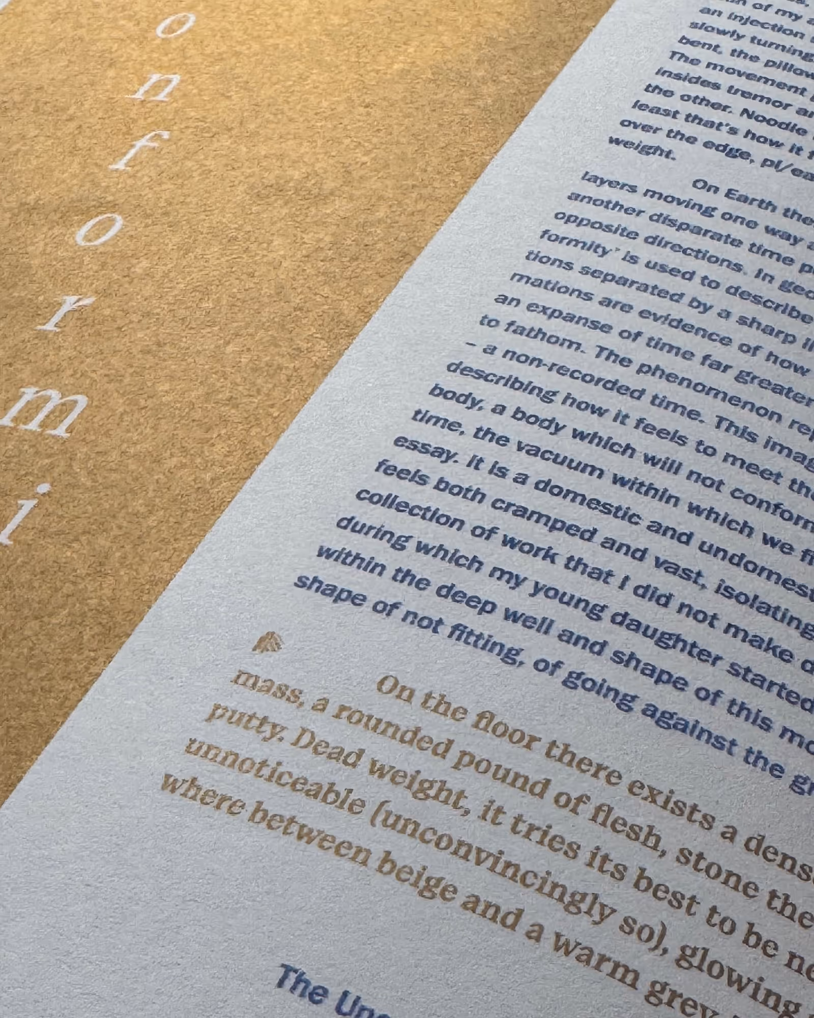
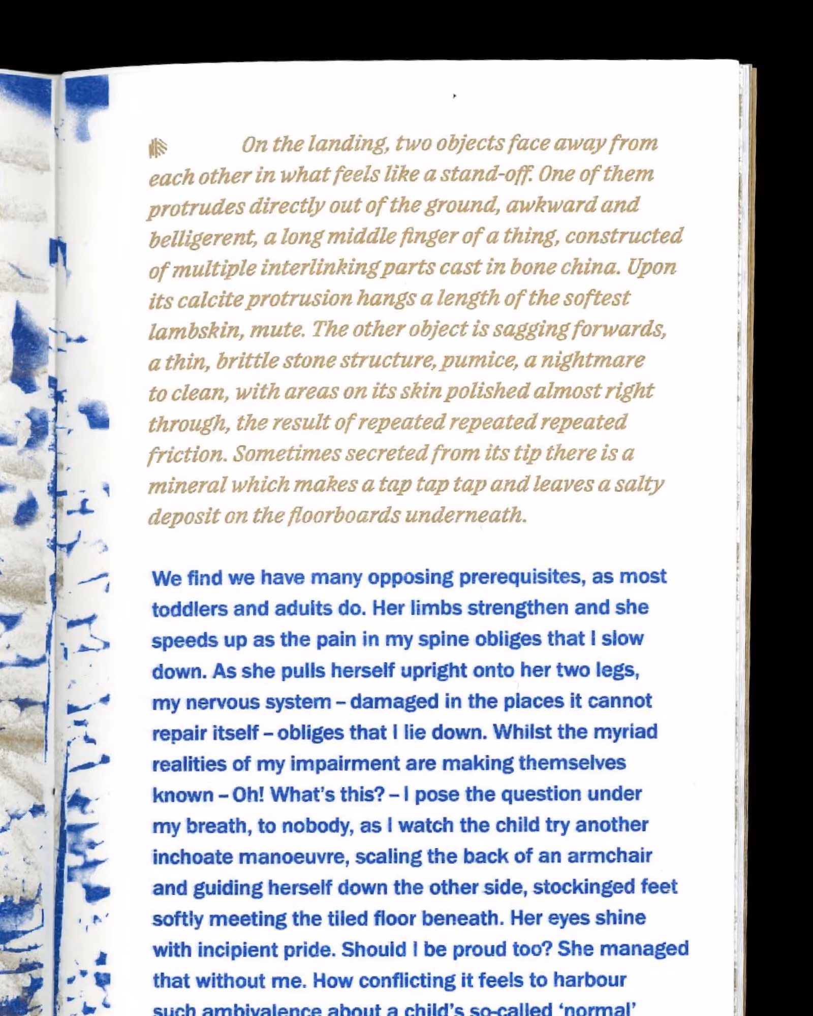
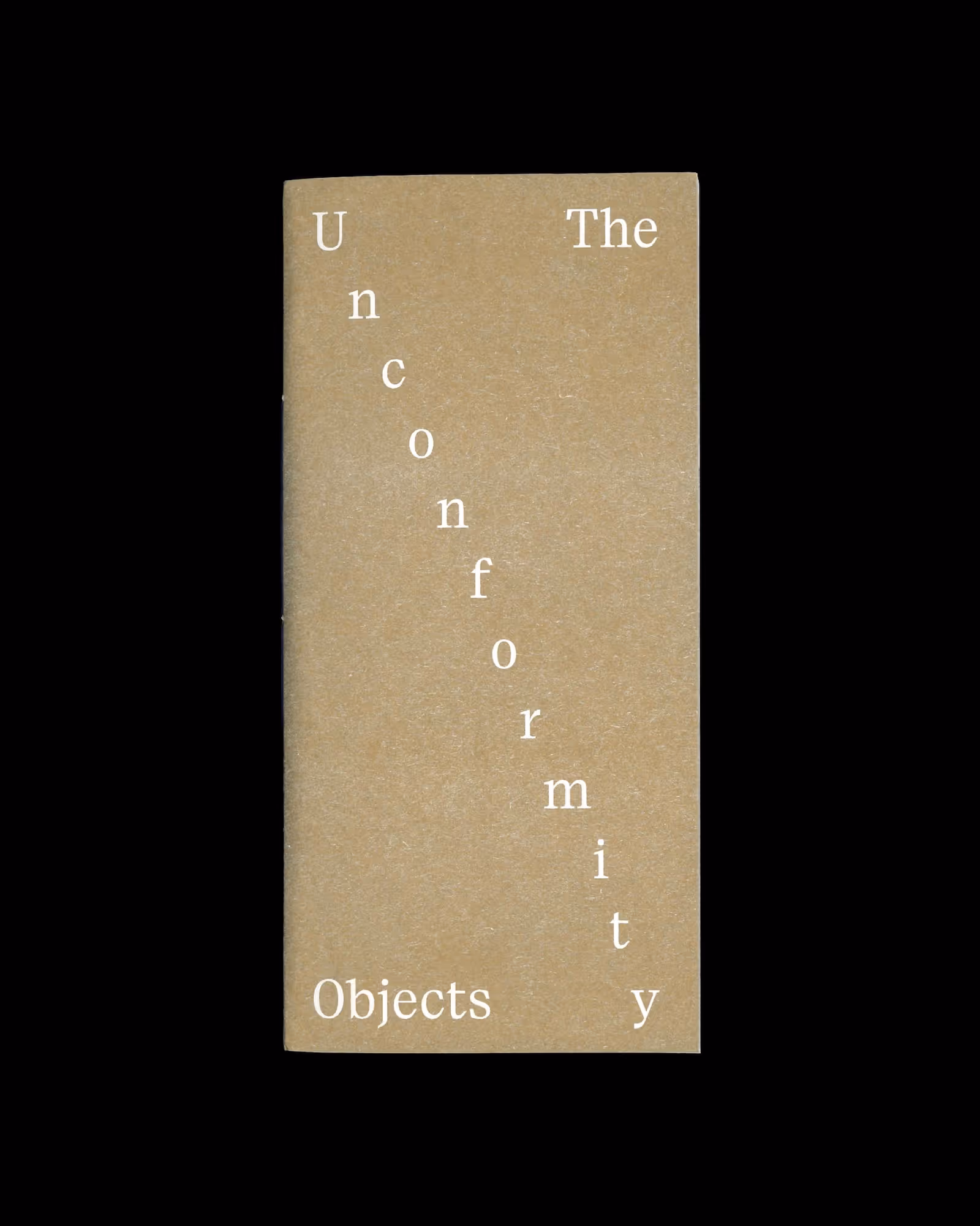
The Unconformity Objects is an essay by artist Bridget O'Gorman, as part of the nonconforming research project Deep Time.
The essay is housed in a wonderfully shiny metallic gold print matched with medium blue ink. The visual language borrows from the Deep Time website which we designed, invoking the earth and a sense of natural time through iconography.
2026
United Kingdom
Risograph printed with Metallic Gold & Medium Blue on Munken Polar Rough
120gsm & 100gsm
Paragraf by Typeji
Franklin Gothic URW by Morris Fuller Benton
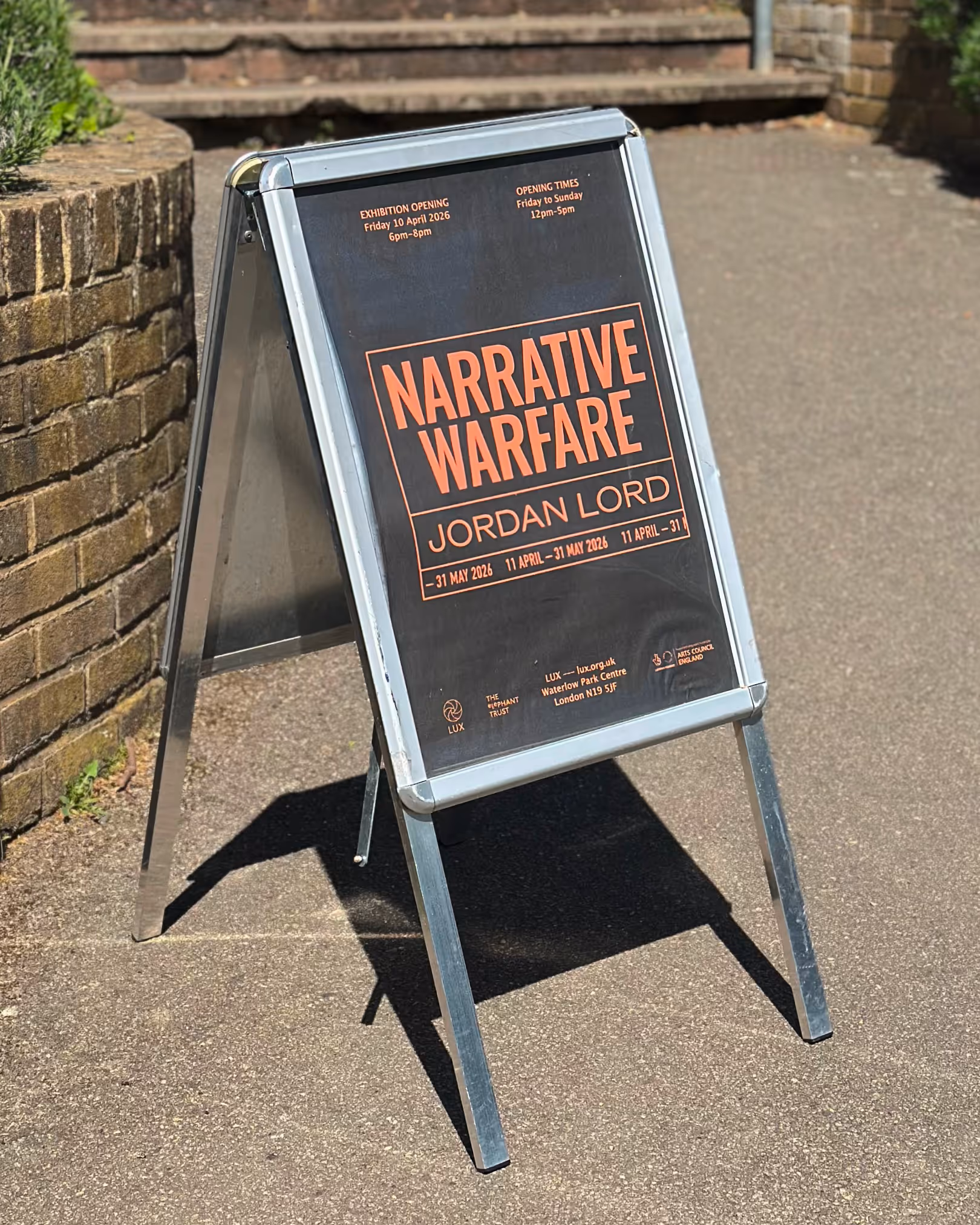
Narrative Warfare is an exhibition of moving image work by artist Jordan Lord, supported by LUX, The Elephant Trust and Arts Council England.
We were inspired by the urgent and matter-of-fact tone of Jordan’s work ‘Concealed and Denied’. The design refers to news tickers and headlines, which form the bedrock of Jordan’s work. We also used Lucida which Jordan uses for all their captions. The audio description by Jordan is a key part of the poster, just like their work, and can be listened to on Instagram.
2026
United Kingdom
Oswald by Vernon Adams
Rom by Dinamo
DIN by Albert-Jan Pool
Lucida by Charles Bigelow and Kris Holmes
Deep Time is a nonconforming, collective research project led by artist Bridget O’Gorman and producers Iarlaith Ní Fheorais and Hannah Wallis. It is supported by EVA International, The Arts Council / An Chomhairle Ealaíon and field:arts.
We designed the visual identity to reference natural forms of time through hand-drawn symbols that were animated by Maya Remenyi. In addition to a podcast section, the website features six micro-commissions by various artists that were built with custom audio players, typographic considerations and integrated transcripts.
2025
Ireland
Symbols animation by Maya Remenyi
Paragraf by Typeji
Franklin Gothic by URW Type Foundry
Saskia Vermeulen
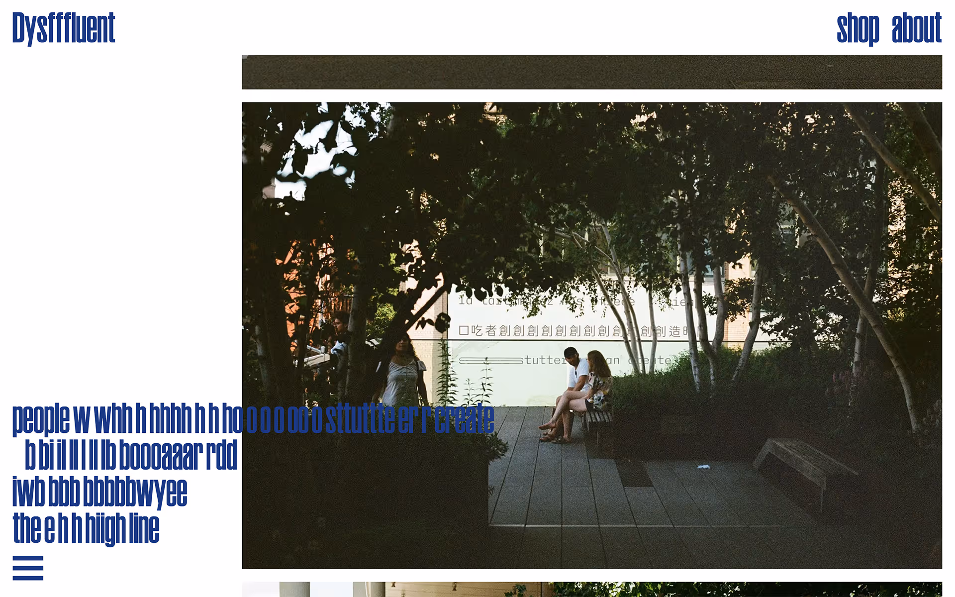
Dysfluent is a creative, collaborative practice about stammering.
We designed and built a part-portfolio, part-editorial website to showcase all Dysfluent’s offerings. A main feature is how the typography repeats and staggers on hover, expresssing a sense of stammering.
2024
United Kingdom
Dysfluent Mono by Dysfluent
Ruder Plakat by Lineto
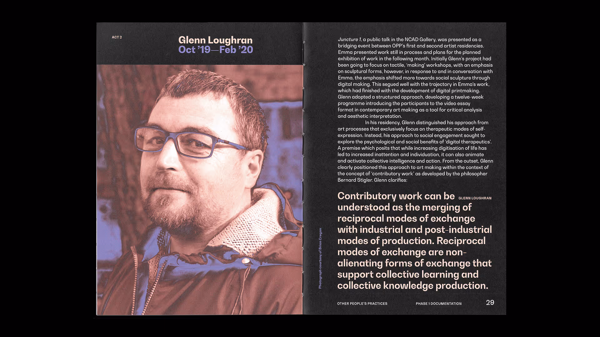
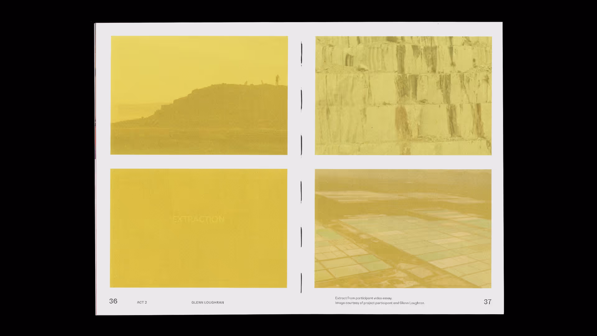
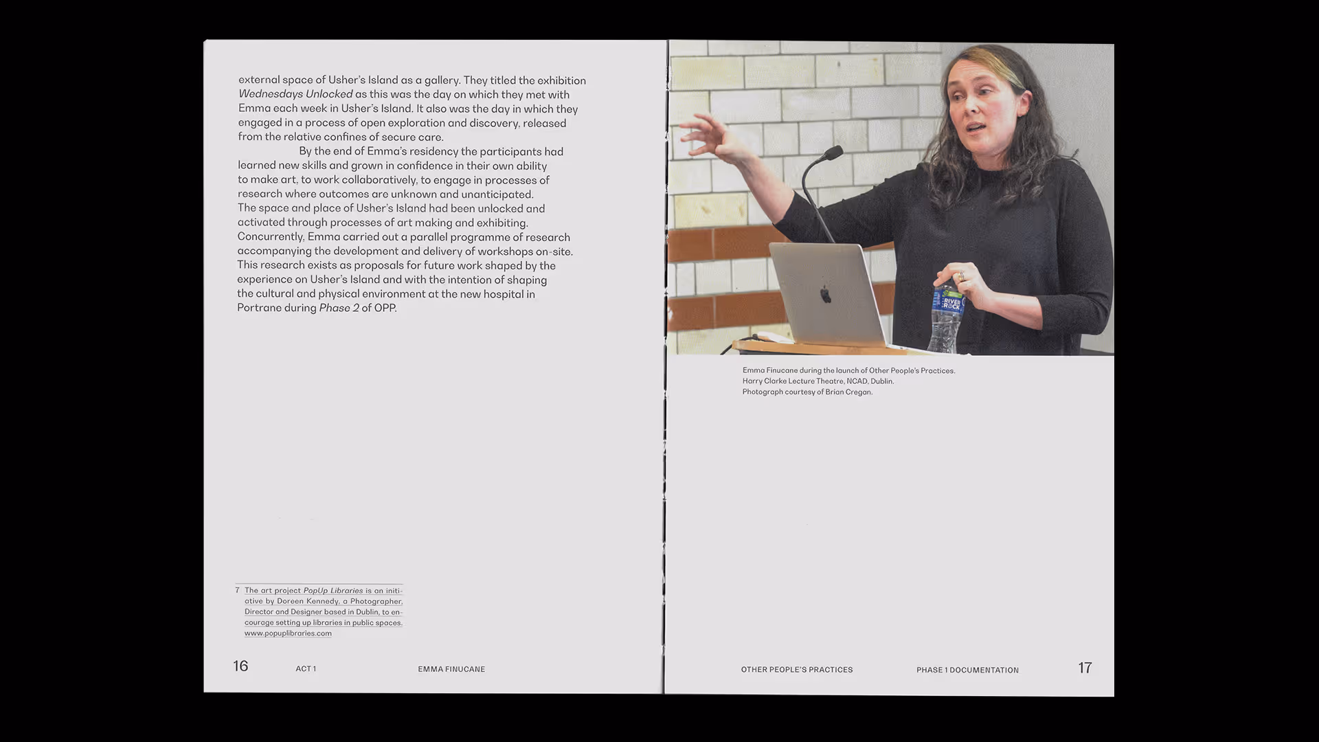
Other People’s Practices: And More Besides is a high level summary of a socially engaged artist residency and research project led by artist John Conway.
We designed the publication to have a wrap-around cover that expressed a sense of enclosure, care and protection. The design built upon the visual identity and website we created years prior.
2021
Ireland
Bw Gradual by Branding with Type
Voice and Media is a three-day festival of dysfluent representation with events across Montréal.
We designed the visual identity, social and printed matter using a bilingual approach. The headline typeface references sound waves to reflect the auditory experience of speech.
2025
Canada
AS Module by Astrae
Stuttering Commons is an international educational initiative generating new understandings of stuttering by producing accessible resources.
We designed and built the website to house several projects such as a library, podcast, editorial section and more. The design utilises custom audio players, a manifesto registry and an interwoven content management system of stuttering knowledge. As consultants on the project we also produce and research content with other team members.
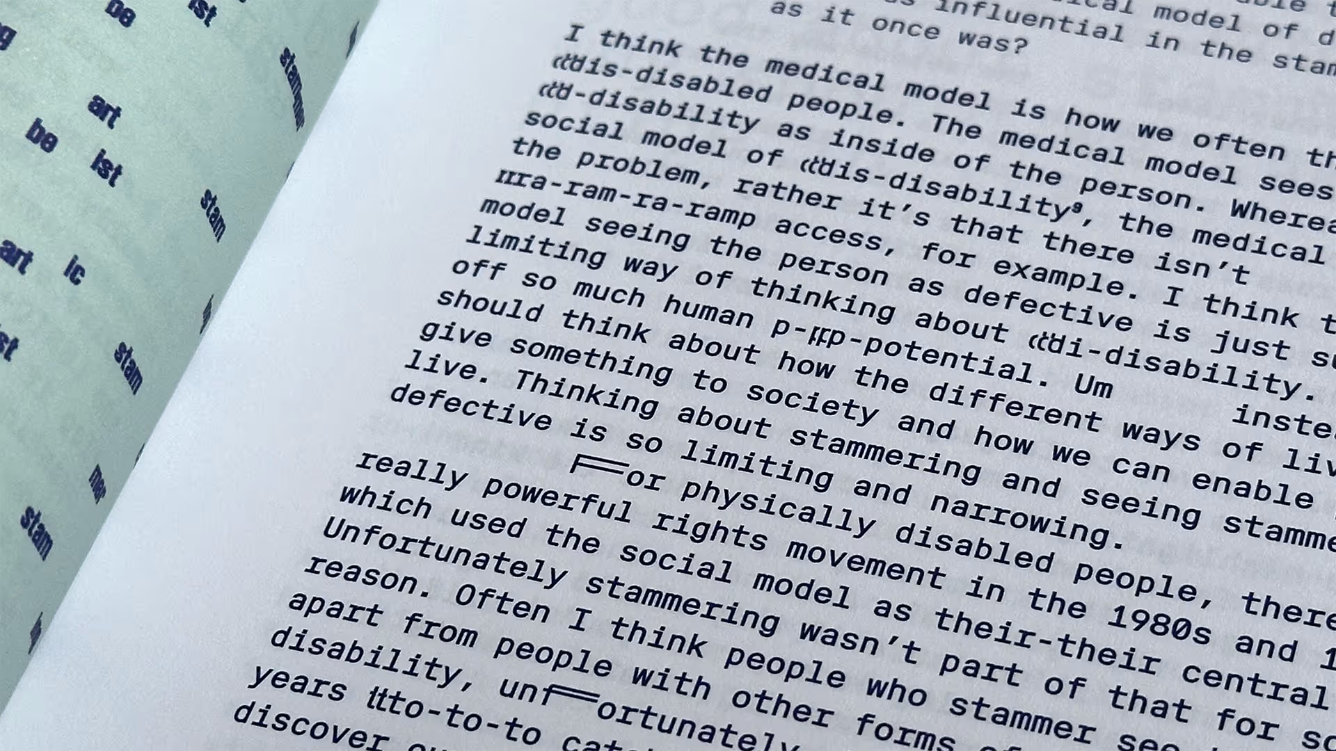
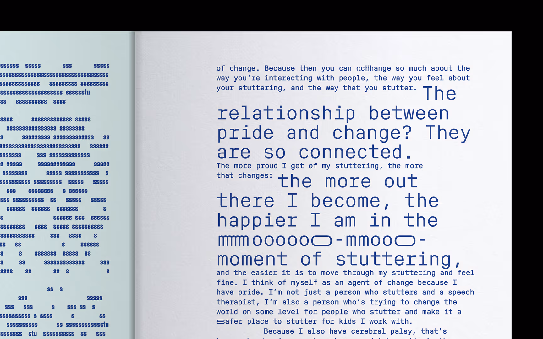
Dysfluent Issue 2 is a magazine about stammering. It is recognised and supported by Arts Council England, 100 Archive, Monocle, and featured in V&A’s 2025 exhibition Design and Disability.
We designed the magazine to reflect the idea of stammering pride: the front cover unfolds to reveal a flurry of inner thoughts; the colours are borrowed from the stammering pride flag; typography repeats and stretches; and pull quotes remain in their paragraphs to challenge the perfectly said phrase.
2023
United Kingdom
Dysfluent Mono by Dysfluent
Ruder Plakat by Lineto
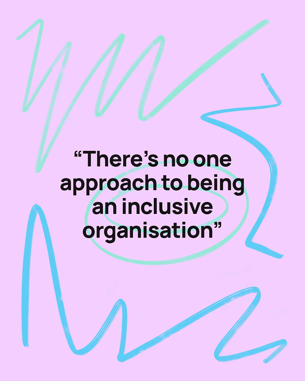
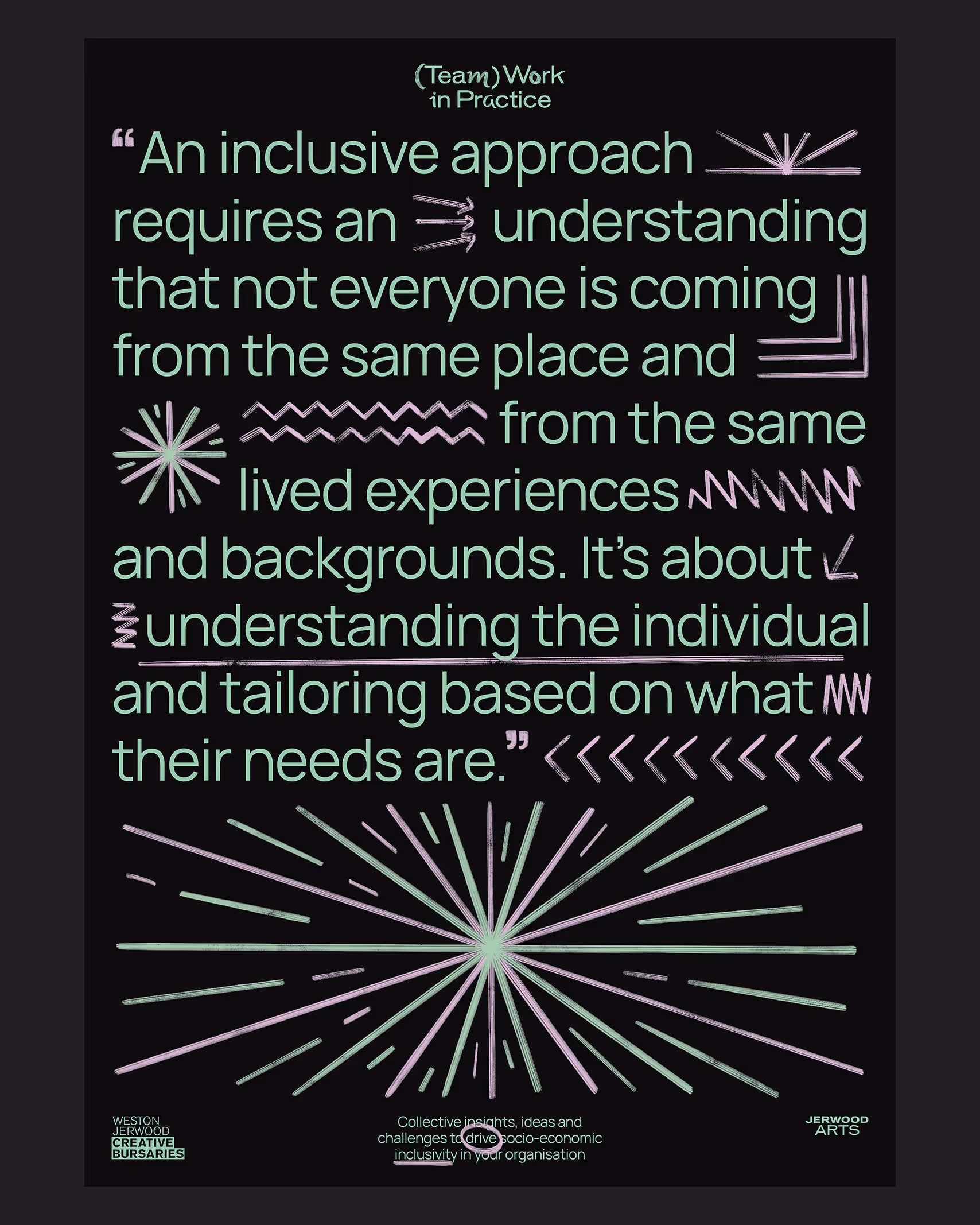
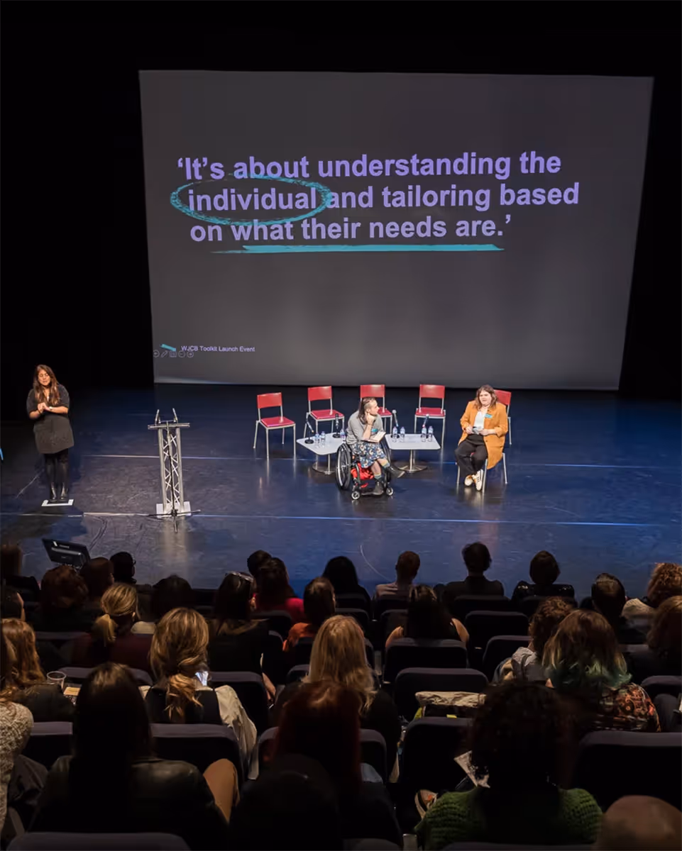
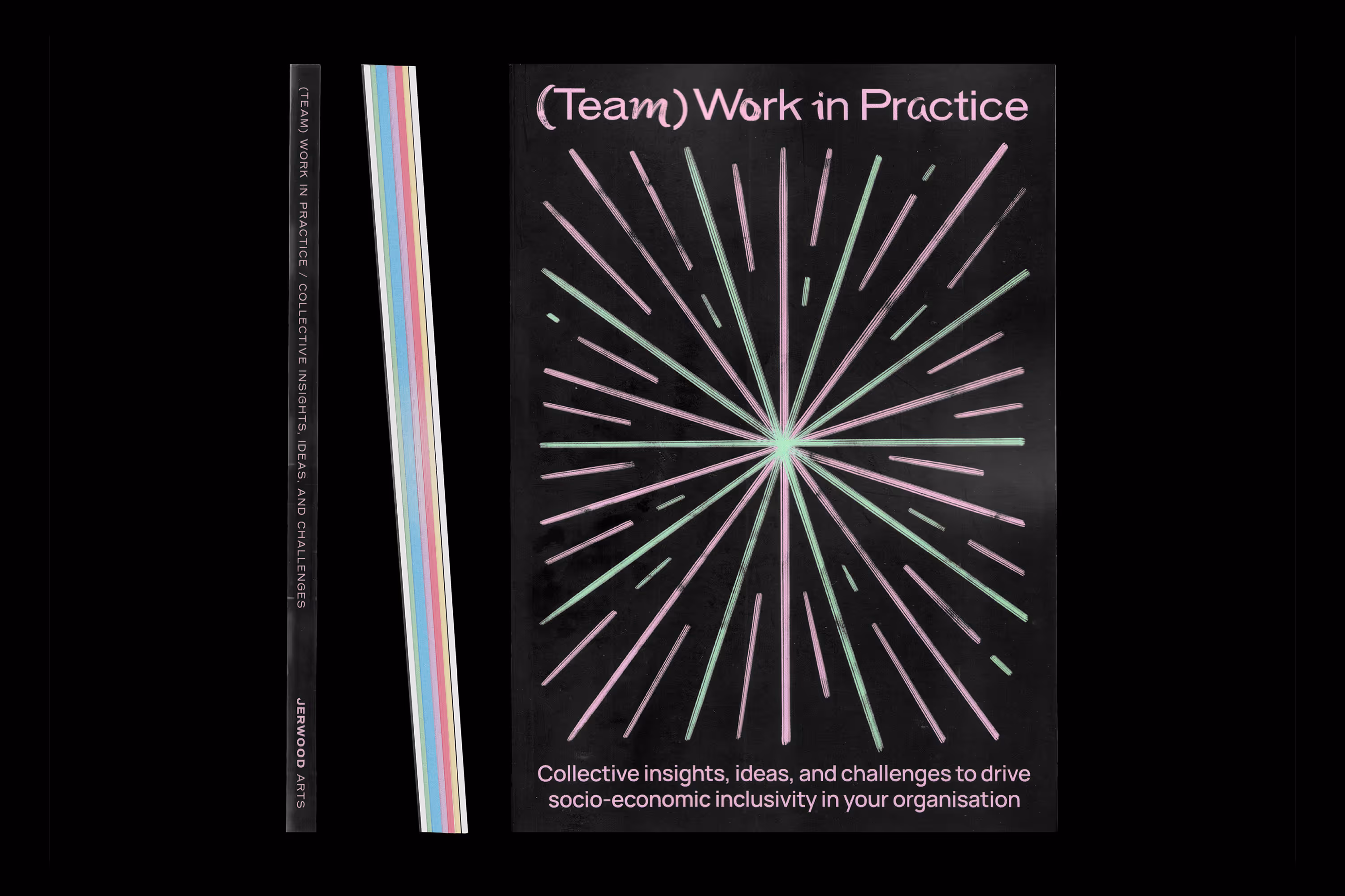
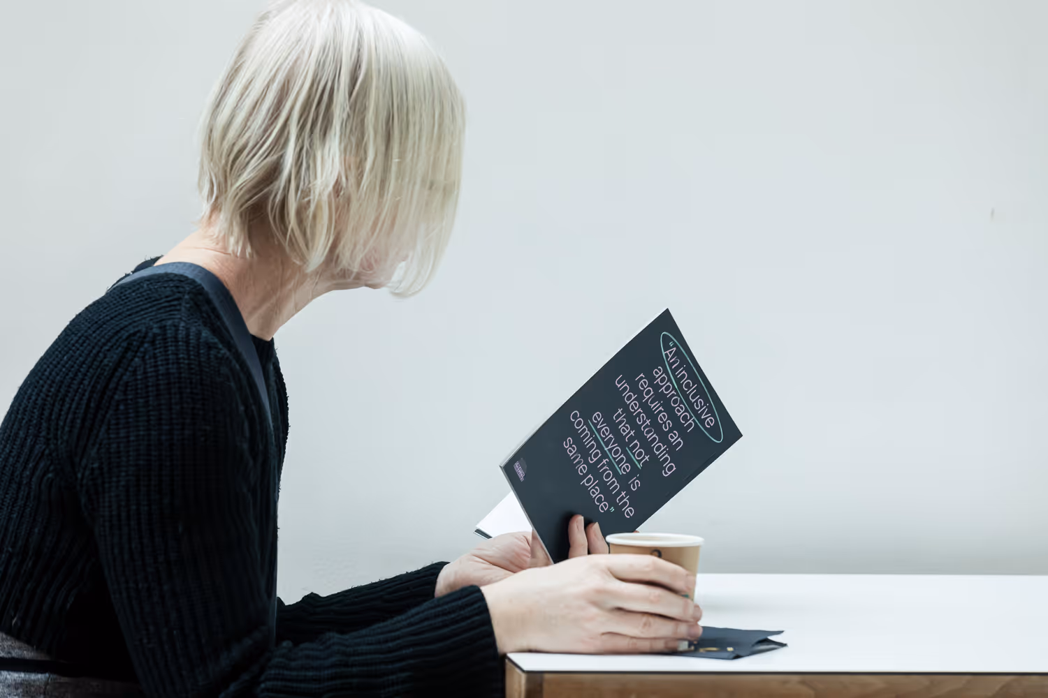
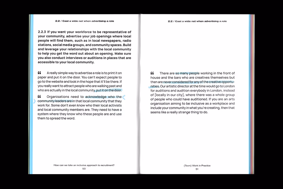
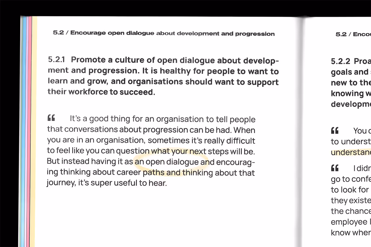
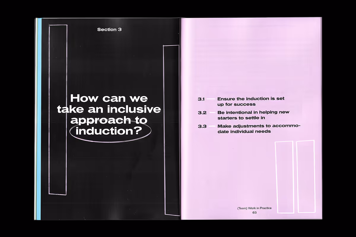
(Team) Work in Practice contains the voices, opinions and thoughts of various Fellows of the Weston Jerwood Creative Bursaries programme. The report is for anyone in the arts and cultural sector who is interested in advancing socio‑economic diversity and inclusivity across the workforce.
We won the pitch to design a printed report, poster and social media kit for the Jerwood Arts team. The visual language merges fireworks with hand-drawn chalkboard annotations, igniting conversations, sparking change and reflecting inclusivity’s constant state of revision as understandings are rewritten and reframed.
2023
United Kingdom
Manrope by Mikhail Sharanda
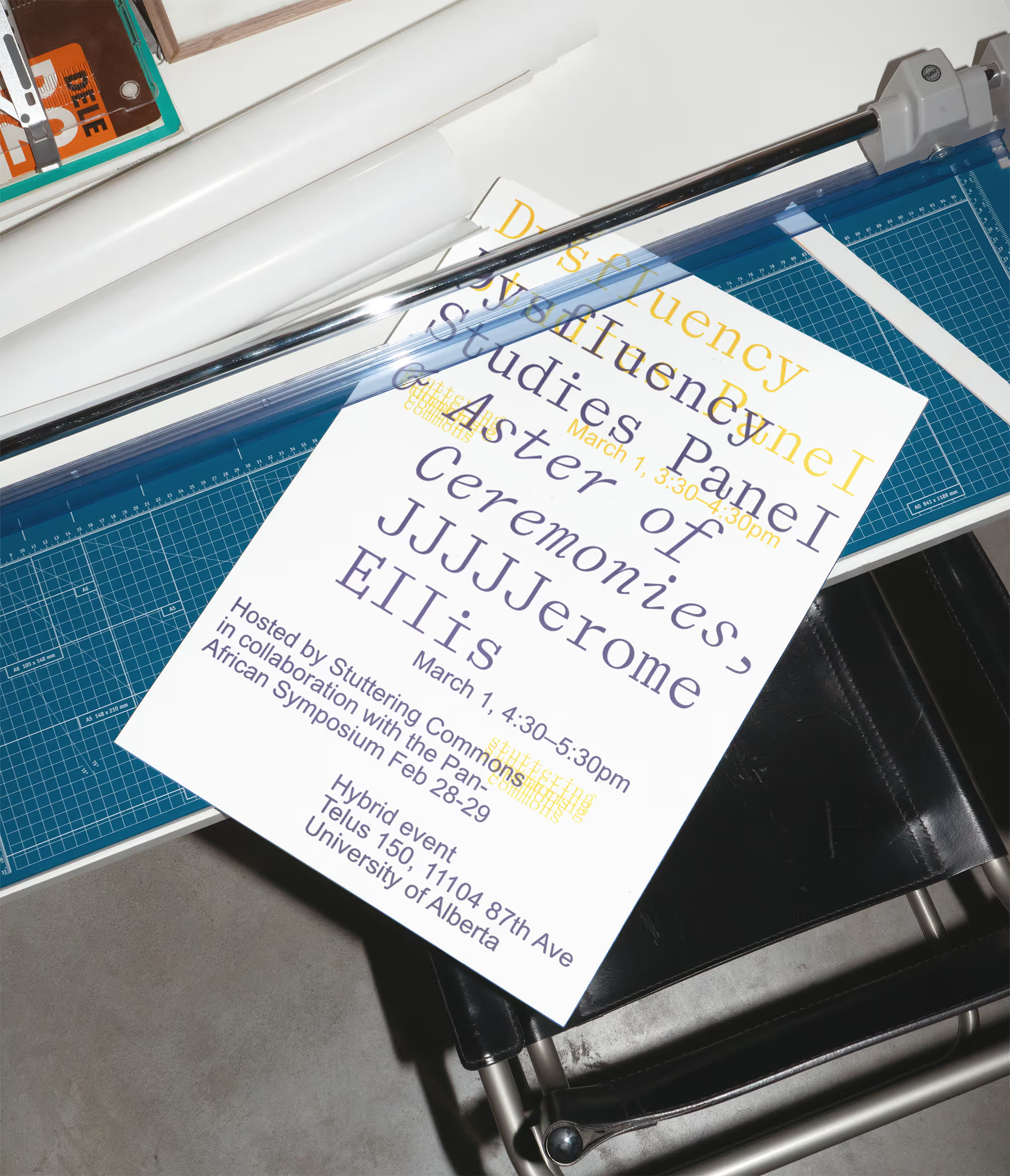
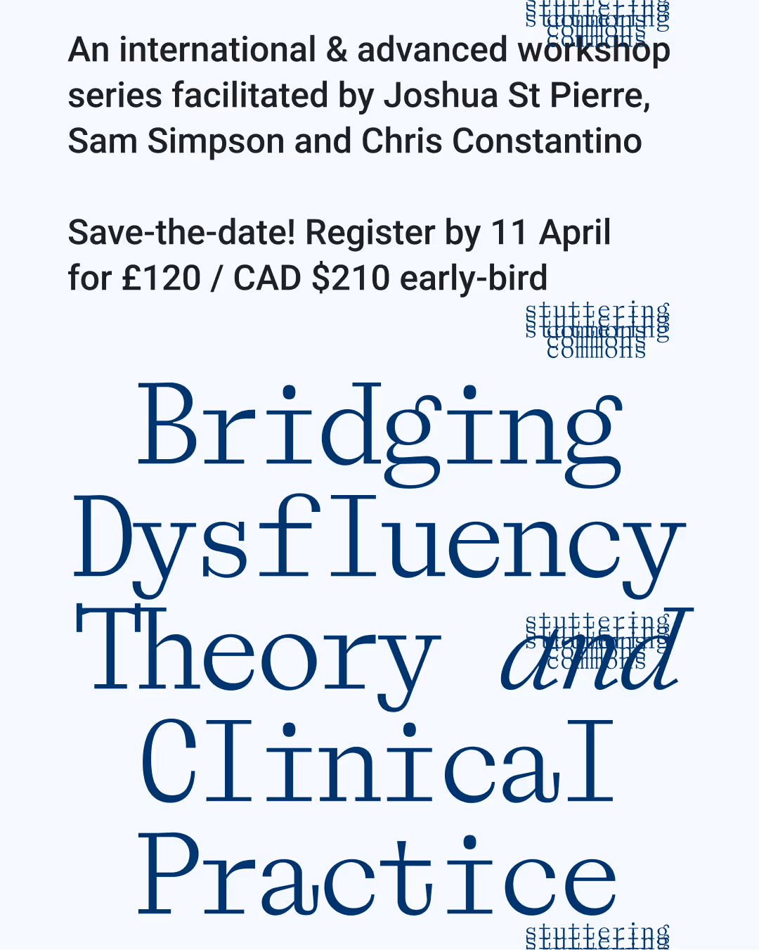
Stuttering Commons is an international educational initiative generating new understandings of stuttering by producing accessible resources.
We designed a suite of social and marketing assets to promote the collective’s projects. The approach references print design and welcomes repetitions, layers and illegibility.
2023–
Canada / Worldwide
Laica by Dinamo
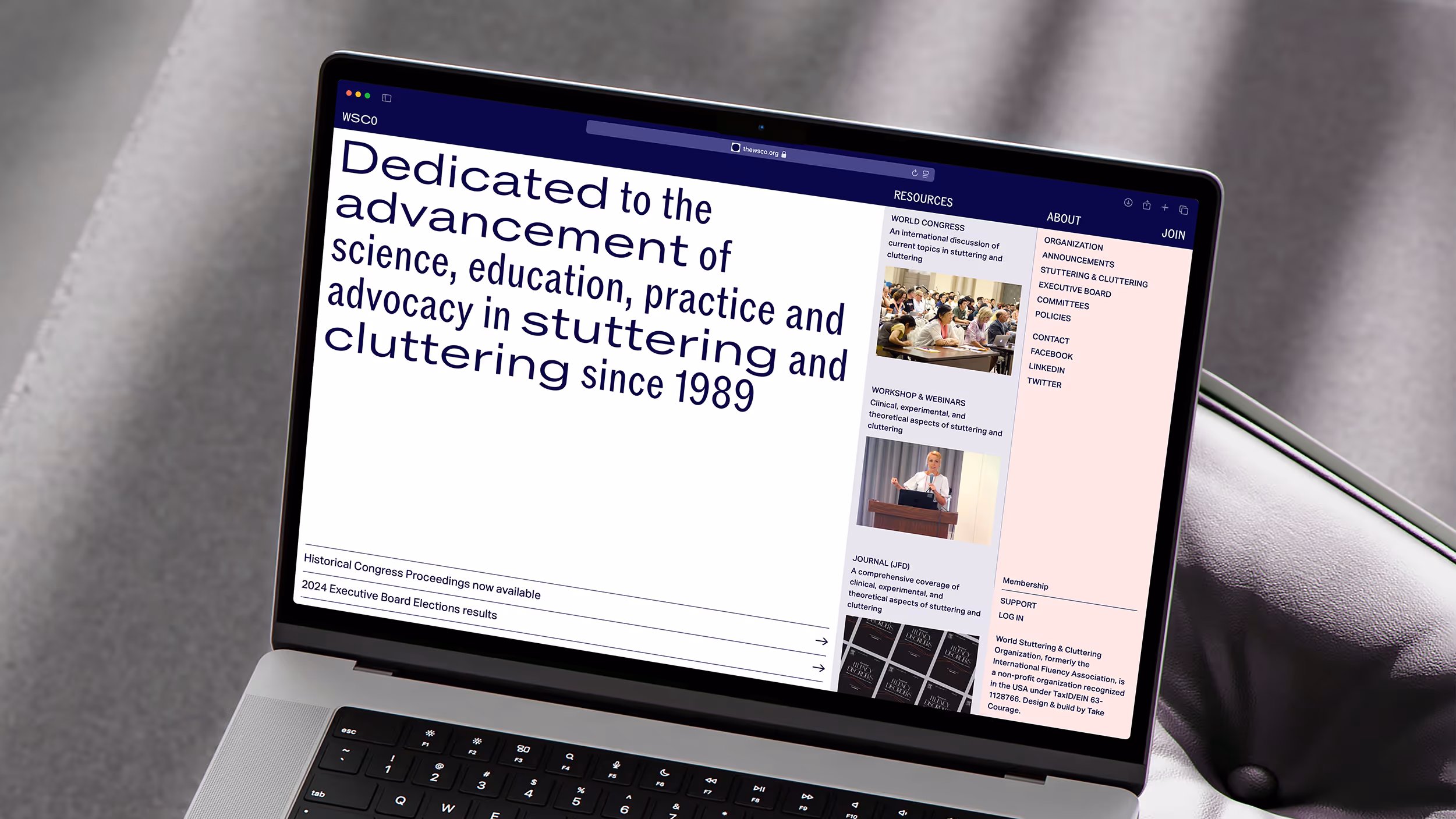
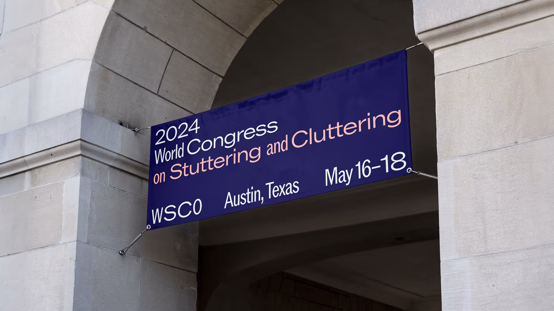
World Stuttering and Cluttering Organization (WSCO) asked us to redesign their visual identity and website to coincide with their relaunch and refocus to represent the very best of the world’s stuttering and cluttering practitioners.
The new design expresses a sense of variability within typography and speech itself. WSCO is now able to more effectively communicate with its members through an account system and more clearly show its offerings that it has developed over the past 30 years including a world congress and academic journal.
2023–
United States
Information architecture by Dan Eames
ROM by Dinamo
Aktiv Grotesk by Dalton Maag
(Team) Work in Practice contains the voices, opinions and thoughts of various Fellows of the Weston Jerwood Creative Bursaries programme. The report is for anyone in the arts and cultural sector who is interested in advancing socio‑economic diversity and inclusivity across the workforce.
We won the pitch to design a printed report, poster and social media kit for the Jerwood Arts team. The visual language merges fireworks with hand-drawn chalkboard annotations, igniting conversations, sparking change and reflecting inclusivity’s constant state of revision as understandings are rewritten and reframed.
2023
United Kingdom
Manrope by Mikhail Sharanda